

portfolio
lau.com


Handoff Kit
DESIGN-TO-CODE
A token-based component system built to speak the same language as engineering from Figma Variables to exportable CSS.
lau.com
portfolio

Context
I'm a Product Designer with a front-end development background (HTML, CSS, JavaScript, React, Vue, Angular), currently working across enterprise UI systems and exploring AI-assisted design workflows. That dual skill set is also my biggest frustration with most design system content I see published: components that look polished in Figma but were never built with an actual handoff to code in mind.
This project was my attempt to close that gap not only as a client deliverable, but as a personal exploration of how far a Figma-native token architecture can go in genuinely mirroring a real codebase.


Process and Key Decisions
1. Building a two-layer token architecture:
Rather than applying colors directly to components, I structured variables in two layers...
-
Primitives: raw values, the actual hex codes.
-
Semantic: usage-based names that alias back to primitives such as color/primary, color/text-secondary, color/border.
Components only ever reference semantic variables, never primitives directly. So the payoff was changing the brand's primary color later means updating one alias, not hunting through every component that happens to use blue.

2. When the palette failed contrast and what I changed:

The kit started from a soft pastel palette (blue and pink tones). Early in the process, I ran a contrast check on white text over the primary blue and it failed WCAG AA (roughly 2.6:1, well under the 4.5:1 minimum for text).

So I introduced a darker variant (#4A6FD1, ~4.7:1 contrast) reserved specifically for surfaces carrying text or icons, while keeping the original lighter blue for backgrounds, hover fills, and decorative use.

This became a pattern I repeated throughout the kit: the same color family, different weights for different jobs. Not every blue needs to pass text contrast, but any blue carrying text does.
Boolean
For changes that alter multiple visual attributes at once (a checkbox's fill, border, and icon visibility changing together when checked). Even though "checked/unchecked" sounds like a simple toggle, it required Variants, because Boolean can only show/hide a single layer, and it can't swap a background color.
Variants
Reserved for genuine show/hide cases, like optionally displaying an icon inside a button.
Text Property
for editable content, like a button's label, so it can be changed from the layer panel without entering the component.
This distinction mattered most on the Checkbox: my first instinct was to collapse Checked and State into a single property (Checked / Unchecked / Disabled) to keep things simple. But that structure had no way to represent a checked-and-disabled state. This was a common real-world case (a submitted form, terms already accepted, now locked). Splitting them into two independent variant properties fixed the gap.


_edited.png)
4. Component Text Field as a molecule:
Rather than duplicating input styling everywhere a labeled field was needed, I built Text Field as a composition, just combining a Label, a nested instance of the Input component, and Helper Text.
Error states follow the same logic: rather than making Helper Text "auto-react" to the nested Input (which Figma doesn't support between sibling layers) each Text Field variant bundles the correct combination pre-configured together. I believe the complexity lives in construction in this case, not exactly in usage.

5. Variables and Styles = one single kit:
Not everything fits into Figma Variables!
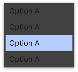
Some effects like shadows aren't supported. Rather than skip shadows or hardcode them per component, I created an Effect Style (called shadow-sm) as a second, parallel token system, applied across Cards and Selects dropdown surfaces.
Variables
-
Used here for color, spacing, and radius.
-
Structured as Primitives to Semantic aliases.
-
Can be swapped as a group to update every component all at once.

Styles
-
Used for shadow effects, adding depth to elements.
-
Created one reusable style, shadow-sm, applied to Card and Select.
-
Figma's older token system, separated from Variables.

Both systems serve the same goal through different Figma mechanisms!

6. Focus for keyboard navigation:
Hover alone isn't enough.
Anyone navigating by keyboard needs a distinct, visible indicator. Each interactive component includes an explicit Focus state using the accent color, so it's never confused with the hover effect.
Results
With the token architecture and eight components in place, the clearest way to demonstrate the system's value is...showing it working :)
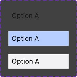
The full kit consists into eight components, each built exclusively from Semantic variables: Button, Input, Text Field, Card, Badge, Select, Checkbox, and Radio.
 |  |  |
|---|---|---|
 |  |  |
 |  |  |
 |
PAGE STILL UNDER CONSTRUCTION
Resume
Laura Hundzinski da Rocha
Download PDF file


Want to know more ?
This case study highlights selected decisions and reconstructed examples.
I’d be happy to walk through the full context, trade-offs, and iterations in an interview.

